CONCEPT DESIGN
The most important page is the one nobody designed.
A location page treated as the commercial page it already is, with opening status, directions and visit information designed for the phone.
Subject: Sabkha Coffee Roasters, an invented specialty roastery and café in Al Quoz, Dubai.
The brief we set ourselves.
Some businesses do not sell online and should not. The website carries the brand and then hands the visitor to a physical room, which makes the location page the one that produces revenue. It is normally a map embed and a postcode field that look like they belong to a different company.
Meanwhile the search that actually decides the visit happens on a phone three streets away, and lands on a third-party listing nobody at the business controls. The site had the answer and was not built to be found with it.
This concept treats each location as a page in its own right: its own hours, its own stock, its own directions, its own questions. It is the exercise closest to the work MAFT is built for, in a market where a great many businesses sell in person and are found on a map.
It is designed as a poster: photography edge to edge with no frame around it, type far larger than a website usually dares, and the one fact that decides the visit pressed over the image as a stamp instead of buried in body copy.
THE WORK
What the frames show.
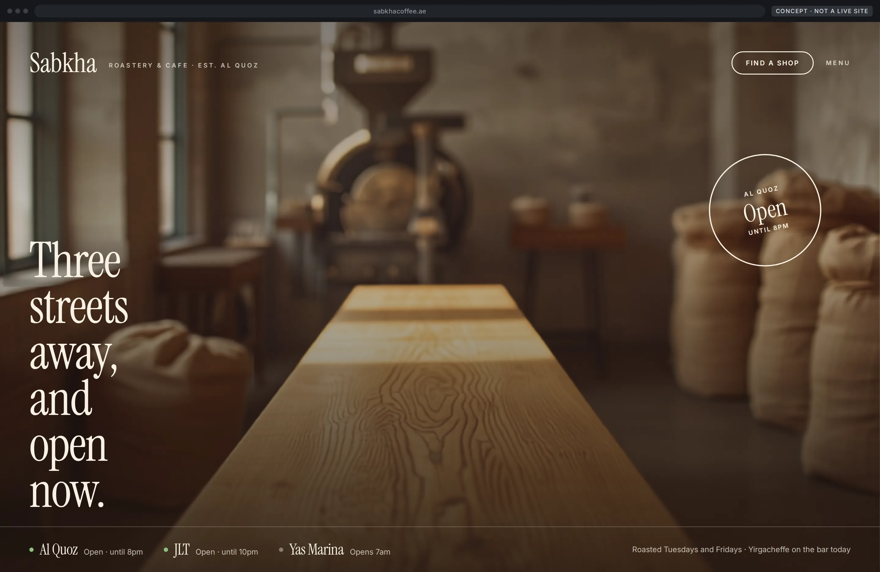
A poster rather than a page: photography edge to edge, the headline set far larger than a website usually dares, and the opening hours pressed on as a stamp.
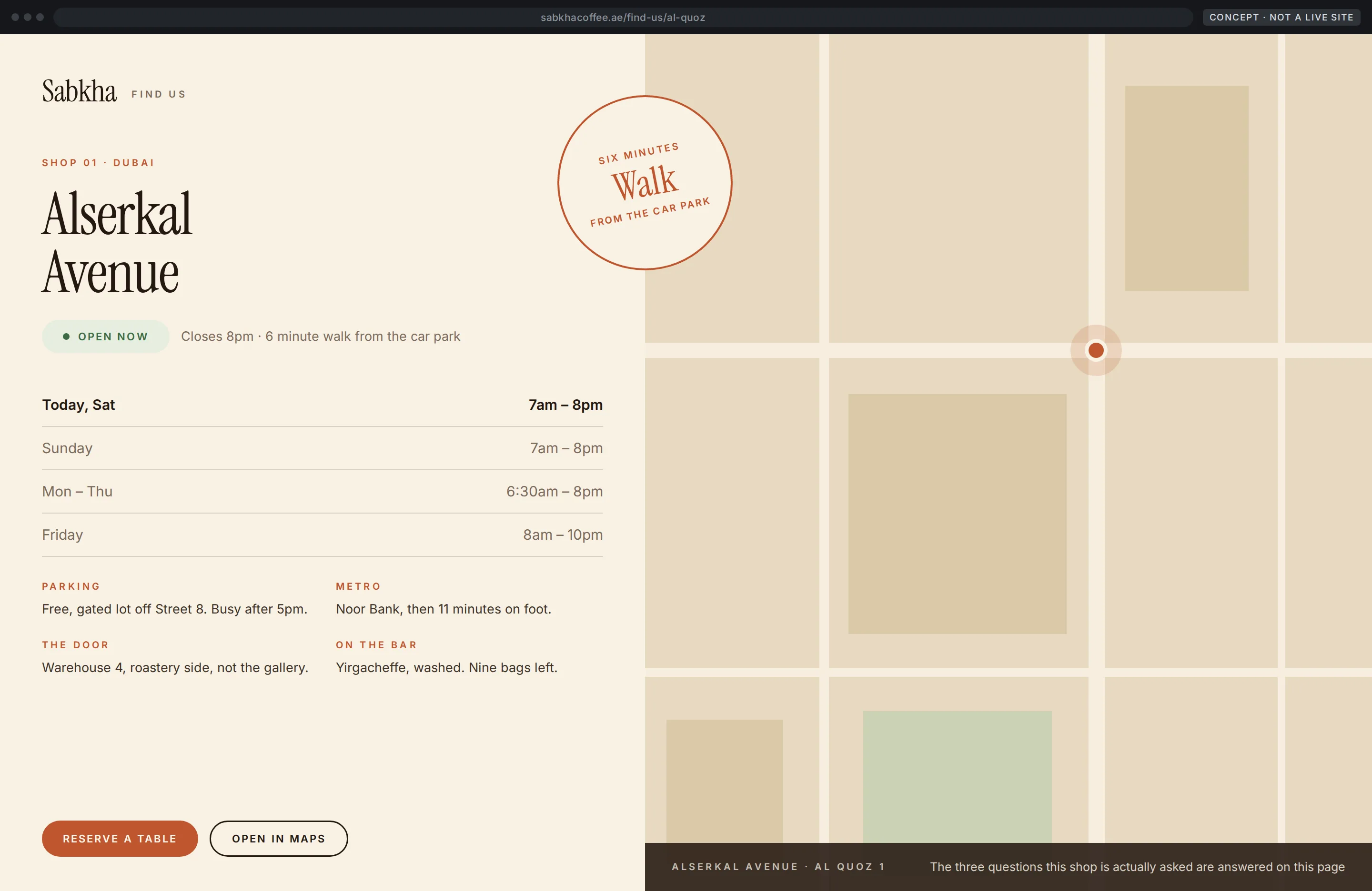
Hours, directions, parking and today's stock beside a drawn plan rather than an embedded map, with the walking time stamped across the seam.
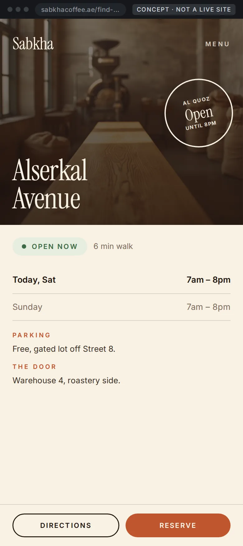
Open now and the walking time are carried in the image itself, so the answer arrives before any scrolling, and the screen ends in two actions rather than a phone number.
DECISIONS
The three that matter.
A page per location, not a widget
Hours, parking, the right door, what is on the bar today, and the three questions this shop is actually asked. A page can rank and convert. A map embed can do neither.
Open now is the first thing stated
The single most common reason someone checks a location page. It appears before the address, in the heading area, not in a table further down.
The map is drawn, not embedded
A styled plan that matches the brand and loads instantly, with the real directions written beside it in words, because that is what people read on the pavement.
What this would mean for your site.
A concept for a company this size is only worth publishing if the thinking survives being scaled down. This is the part that does.
- 01This is the local SEO problem in its purest form. A business that converts in person needs the profile, the location pages and the site all saying the same thing.
- 02Location pages both rank and convert, and they are almost always the last thing built and the first thing neglected.
- 03Reservations and direction taps are countable in a way that footfall is not, which is what turns this from a design opinion into a monthly report.
ABOUT THESE CONCEPTS
Every business in this section is invented. Sadara Clinic, Qamra Barbers and Sabkha Coffee Roasters do not exist and are not stand-ins for clients. Their names, prices, opening hours and locations were created for the exercise. Nothing here is client work, a proposal or evidence of results. Every visible asset was made for this exercise, and no real company identity appears in the designs.
NEXT MOVE
Rather see this thinking on your own site?
Tell us what yours has to do and we'll say where we would start.